Create 2 engaging two-page magazine spreads using your own imagery and incorporating ChatGPT-generated information (as this is an imagery design not an essay). Your design should seamlessly blend visual elements with informative content, captivating the audience’s attention and effectively communicating the chosen topic or theme.
Specifications
Size – 2x A4 double page spreads
Colour Mode – CMYK
Bleed – 5mm
Margins – 12.7mm
Rationale
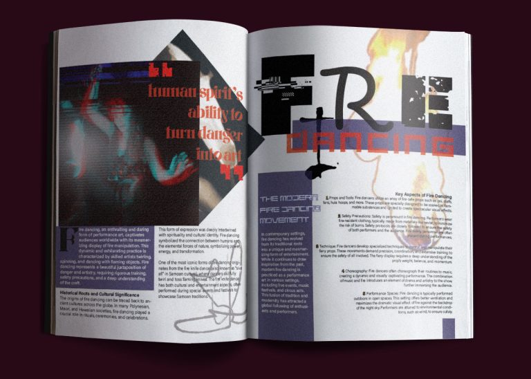
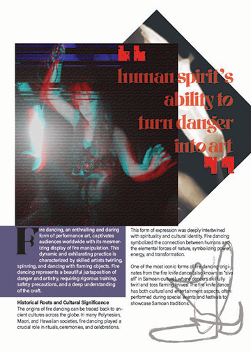
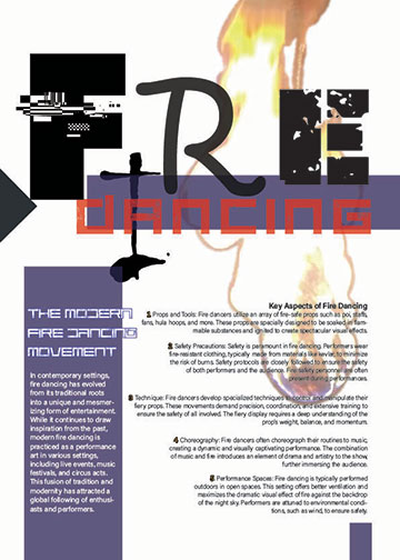
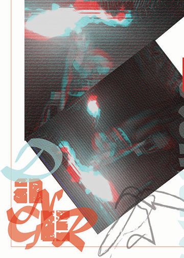
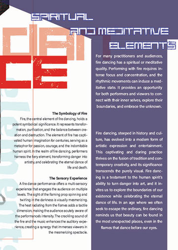
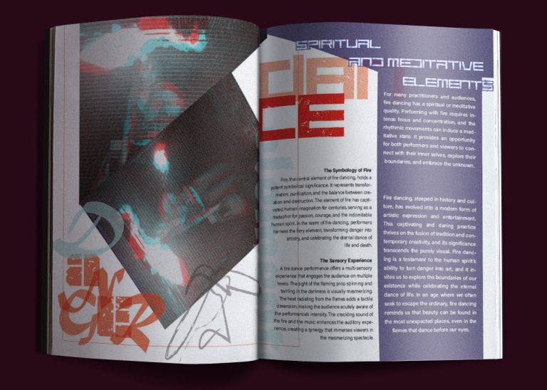
All images used in are my own photographs using my phone. Using Photoshop, I altered the images to look similar to flow through the article. I used Glitch Actions to create effects.
Process
I waited for nighttime and had to make sure I didn’t hit anything with the ropedart before I lit it up on fire. I used special fire lighter liquid all over the ropedart then lit it up. A lot of the photography was captured in motion. There were issues with the camera in and out of focus with the flame of the fire. I ended up using 2 posed shots and 1 motion.
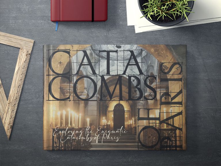
Artist Book
Type Design - Booklet Guide
Assessment – Type Publication Location Guidebook
Brief
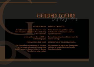
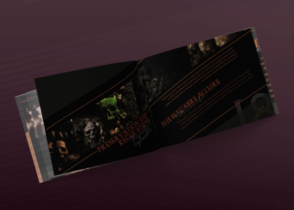
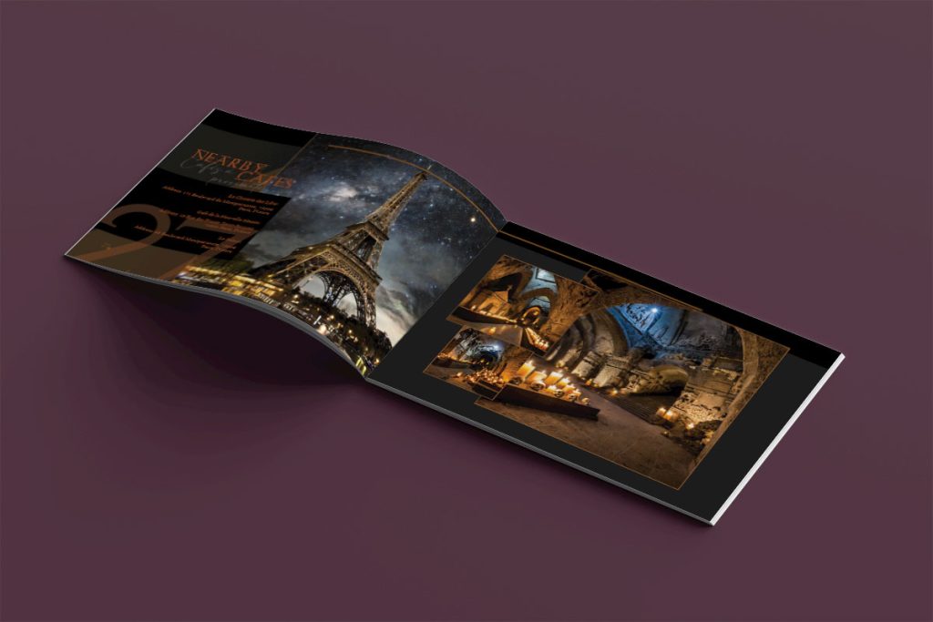
For the content, you have a choice: You can link this project with the Location Branding Assessment from your Branding Unit OR you can create an entirely new project with a topic of your choice. e.g. types of festivals, types of tours or guides, annual shows or events, historical or geographical brochures.
Pages – 20 page booklet
Size – the booklet will be A5 (210mm x 148mm) in the orientation of your choice
Binding – Saddle stitched
Bleed – 3mm
Colour – CMYK
File Type – Packaged InDesign file (including links) plus a Press Quality PDF with printers marks and bleed
Rationale
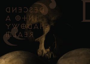
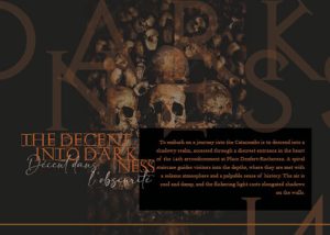
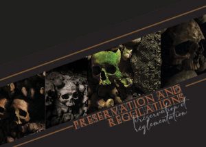
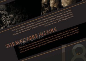
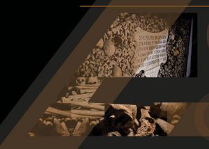
What did you enjoy about this task? Seeing how well 2 different fonts can go together – upper-case and harsh font with lower-case elegant and cursive. Using creative freedom and enlarging page numbers and placing randomly on the pages whilst keeping in mind the balance of colour on the double spreads. Layering images, fonts, opacities and colours.
What was the most important thing you learnt about typography and print? Not everything goes together. There is a need to find a voice for the image – match the typography to the form and images
How did your initial inspiration examples influence your final design? Playing with shapes and making images more interesting. Typography pairing with heading, sub-heading and body fonts.
What was the most difficult part of this task? Having a vision in my head and trying to find the stock images that are close to what I am searching for. Also the Paragraph Styles. At first I had no idea and trying to wrap my mind around how they help format the whole booklet. After a little play around with them, they became super helpful to edit leading, tracking and font changing throughout the booklet.