Poster Design
Digital Communications - Mini Festival Campaign
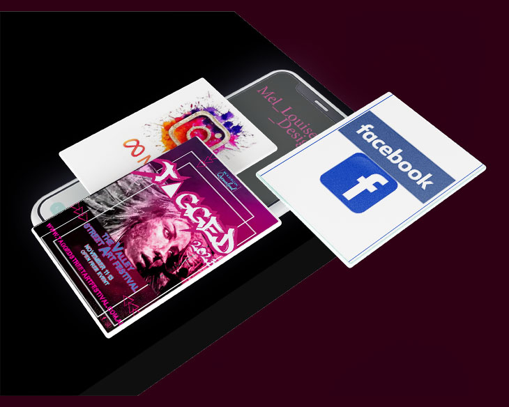
Brief
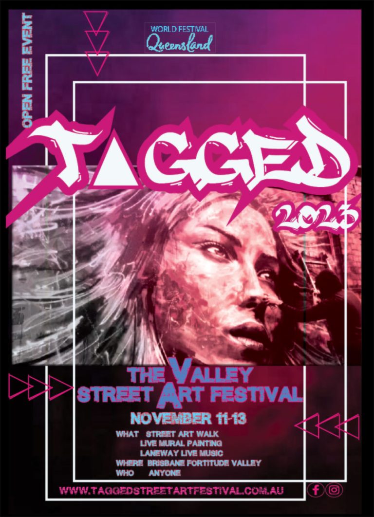
The client is an events company called World Festival Queensland, that is planning a line-up of events to celebrate international festivals. As travel has been non-existent for the past couple of years, the client has decided to bring the world to Queensland. This will be the first year that the min festivals will take place, but if successful, they will soon become annual events.
Platform Specifications
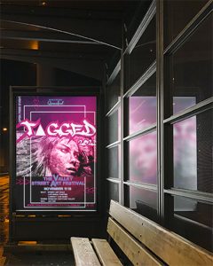
Print – Bus billboard A2 size, 3mm Bleed.
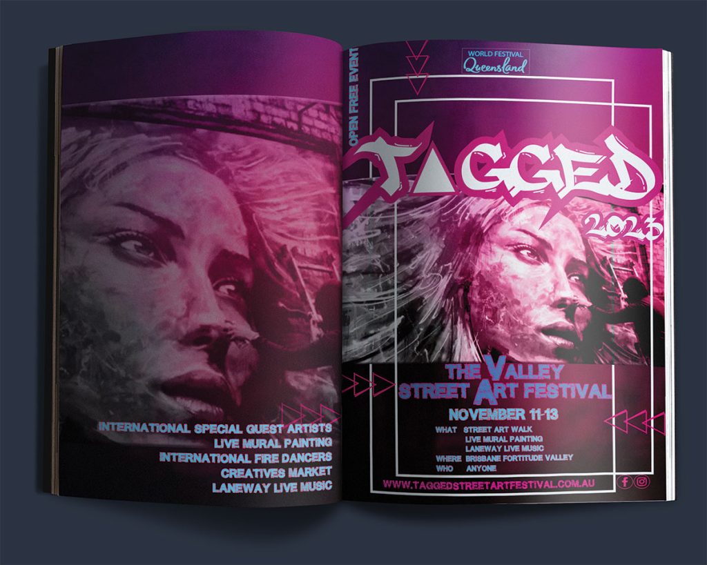
Print – Magazine full page spread 210mm x 275mm size, Margins 10mm, Bleed 5mm.
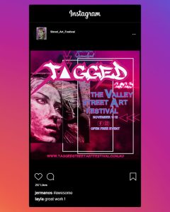
Digital – Instagram ad 1080 x 1080 pixels.
Digital – Instagram story 1080 wide x 1920 tall pixels.
Rationale
How graphics can be used differently as a communication tool on relevant platforms
Billboards can leave a lasting impression and attract the interest of people in vehicles from just a brief glance. Magazine ads can easily be a page turner, so you need an eye-catching design followed by more information about the event. Social media/Instagram ads are extremely short so the least number of words with a strong message.
How the purposes and principles of advertising were considered and applied to the work
Whilst considering the principles of advertising, capturing the interest and engage with the consumer, I haven’t overcomplicated the design or used any misleading information. There are no brand endorsements involved so the consumer isn’t forced to purchase. The colours and the event itself do peek and interest as it hasn’t been done before and strikes the inquisitive nature of the consumer.

History, Type & Illustration - Design Period Poster
Brief
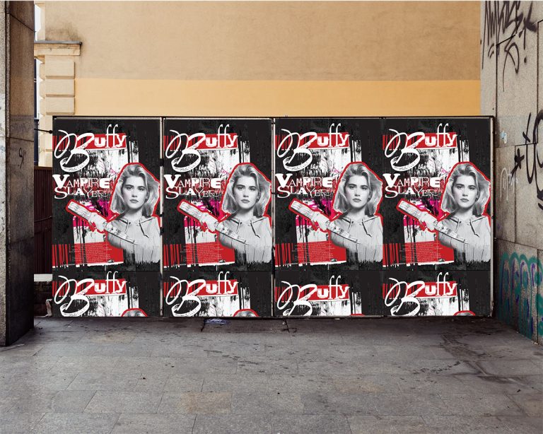
Create a captivating movie poster of your choice employing an art style that resonates with the theme, genre, or mood of the film. Your poster should effectively communicate key elements such as the title, imagery, and tone of the movie, enticing viewers to engage with the content.
Specifications
Chosen Movie – Buffy the Vampire Slayer
Art Movement – 1980’s Grunge
Size – A2
Bleed – 3mm
Colour Mode – CMYK
Rationale
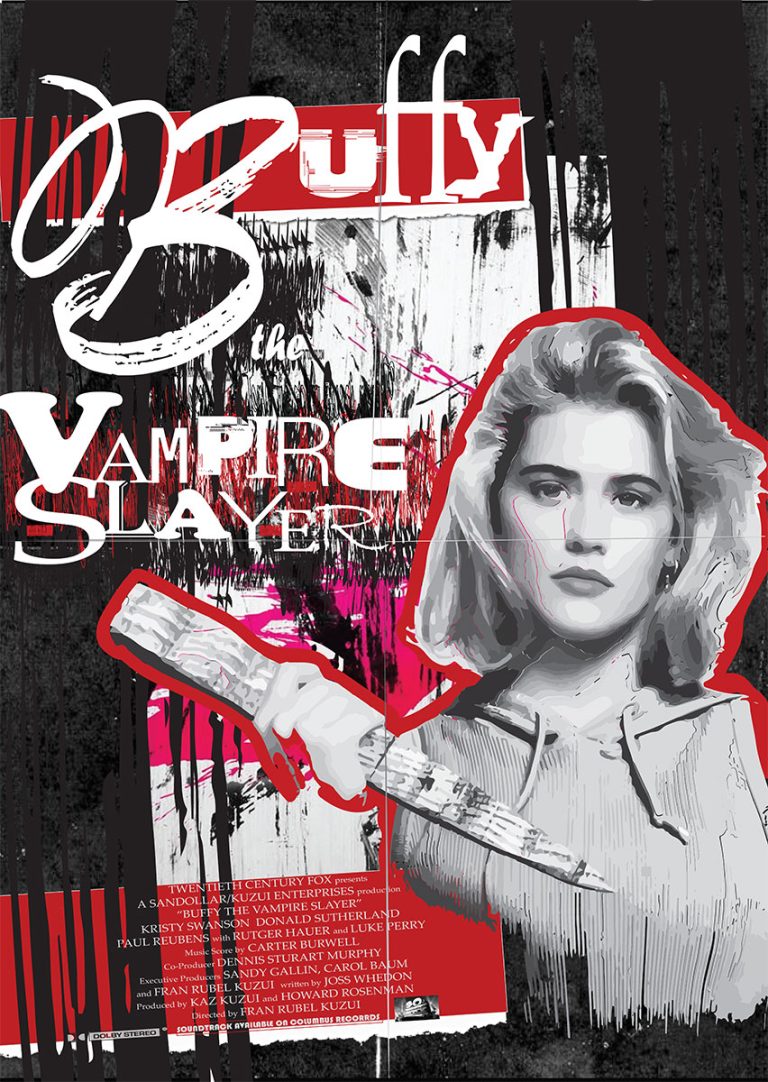
Creating the poster, I just had to stick to the more gritty and scratchy textures and use a black and white main figure. I played around for a while trying to find a good texture for the main character.
During the research, I firstly found it difficult to find contemporary grunge works from right now but once I stopped thinking so hard about it all, it came to me quite easily.
Poster Concept
Grunge background, torn paper effect, used around 17 different fonts, created scratch effect behind movie title with place holder text in a funky font then squish angled it to not even resemble text, made behind the title pink but then it was suggested that I make it red for blood, put red highlight around Buffy to signify the 80’s grunge era, pause the credits of the movie to make an authentic blurb at the bottom with actors, directors and team that worked on the movie.


mel_louise.by.design
where graphic design reigns with art