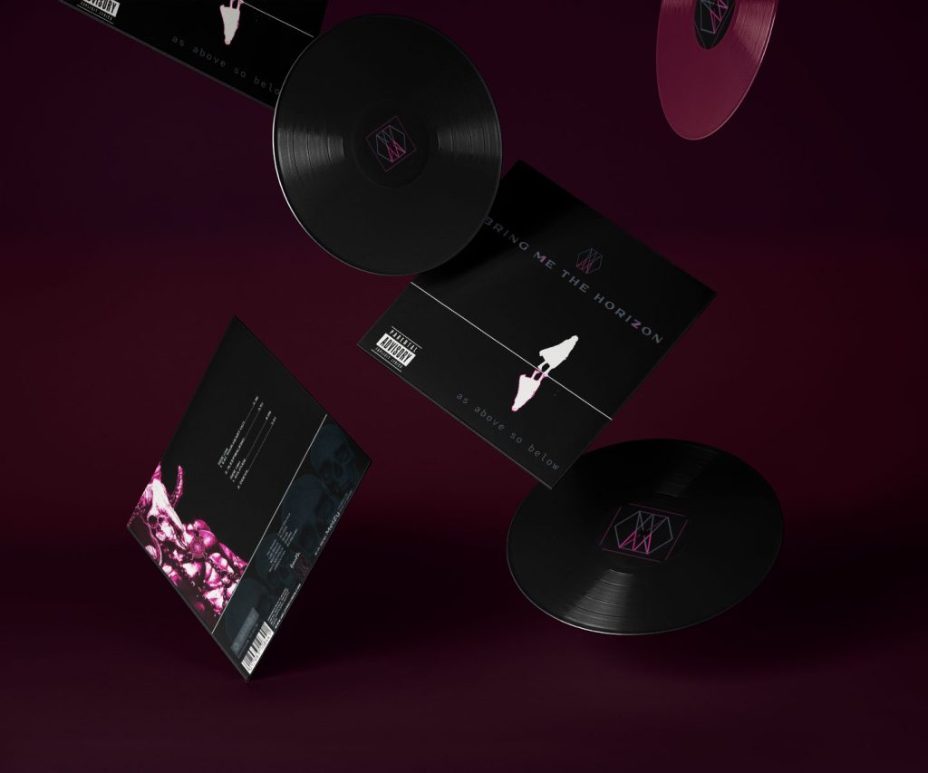
Vinyl Album Cover
Image Manipulation - Photo Montage

Assessment – Photo montage
Brief
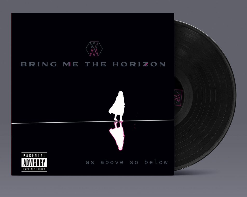
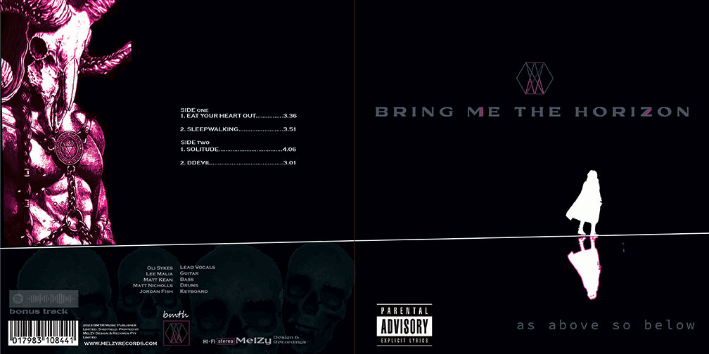
Commissioned to create a cardboard jacket for a 45cm vinyl record. The photo media for the front cover should maintain hierarchy, and imagery should be a reflection of the band’s style with limited typography. Album title and band’s name are to be included in the design, but the imagery is to be the focal point.
Limited category imagery was to be at my discretion but has to include 1x scanned image, 1x styled photo and 1x stock image.
Band – Bring Me the Horizon
Music genre – Metalcore
Artistic Style – Surrealism
Size – 7inch vinyl
Bleed – 3mm
Colour – CMYK


Rationale
Personal: I believe that my vinyl album cover design was a success. Given the brief of limited category imagery to my discretion, I was able to pull all elements and principles together to form the design.
I was extremely surprised at what came together as this final product was not my first concept I started creating when given the assignment.
Professional design: The figure walking in isolation, being followed by it’s reflection is the main focus. Using contrast to make the image stand out and direction with line to show movement/travel.
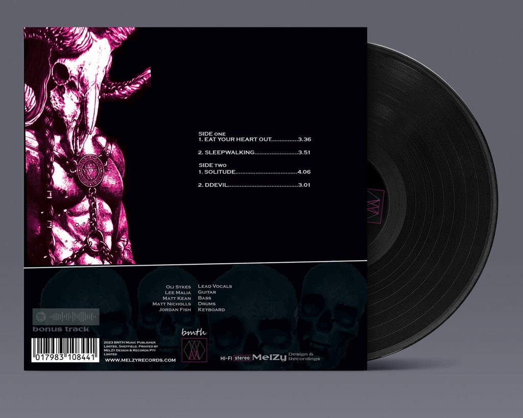
Monochromatic colours to give depth and mood, whilst using opacity to fade the skulls, so everything isn’t clashing, fighting for attention.
There’s scale & texture on the devil figure being huge whilst the white silhouette is small and flat white. The design isn’t congested full of imagery, there is a lot of white space to breathe.
The font chosen is a slight slab serif font which isn’t too solid and heavy.
Artistic artwork: The piece as a whole tells a story. Before the fonts, the whole cover shows the devil, mystery of death, space, colours, line, balance and I believe it works by the golden rule. Throughout symbolism used in every piece placed on the design.


mel_louise.by.design
where graphic design reigns with art